Wednesday, September 30, 2015

Unusual and Interesting Photos

Part 1


Q&A
  1.  Christian Rhum has a very unique style that takes famous buildings and presents them in an abstract way. I think it's a very interesting and cool style that captures the viewer's attention.
  2. I think that he took three different photos of the tower at different angles and then overlapped all three of the photos to create one abstract photo.
  3. Buildings like the Leaning Tower of Pisa, the Statue of Liberty, and the Empire State Building would all be good places to take abstract pictures like those of Christian Rhum.


Part 2

under construction

Part 3

1. 3 Important Tips for Photographers


1. Leonardo da Vinci's painting of the Mona Lisa shows an excellence example of the connection between the photographer and the subject. The relationship between the photographer and the subject is  an essential element to consider because it can effect the result of the picture. The expression on the subject's face and the atmosphere that is conveyed are important elements that can differ depending on the connection.


2. Good pictures have a story. Norman Rockwell's painting, titled The Runaway, shows this. The story behind the photo should clearly tell the viewer what is going on. Sometimes if the story behind the photo is vague, it can capture the viewer's interest.


3. Capture the unexpected. Juxtaposition is an element used in writing and photography. It takes two things that are very unlike and pairs them together to create a powerful and conflicting message. Paintings by Banksy uses juxtaposition a lot to reach out to his viewers.

2. Favorite Painting


3 + 4. Real Photo Comparison


This photo, taken by Nick Stern, mimics one of Banksy's paintings of a man dressed in black and throwing flowers. This photo captures the same message that Banksy conveyed through his painting. It uses juxtaposition, pairing a shady figure with a bouquet of flowers in place of what people would normally expect a bomb.

5. I think the style of painting in The Runaway where the story is evident in the picture is something that I will look out for in my future photos because I think it's a very effective style to capture the viewer's attention.

Thursday, September 24, 2015

Academic Shoot Preview

The One With the Best Story


The three subjects in the photo (the two students and the teacher) clearly share a close or familiar relationship. Both students look to be seniors, though that's up to speculation. The story in this photo is that of two students who are graduating, who are sharing one last picture with their favorite teacher or a teacher they've known for a while. 


 The One With the Most Emotion


 There's a lot of visual activity presented in this photo. Two girls are preforming a water experiment which has resulted in a strong chemical reaction. Foam flies everywhere, splattering the two girls. The girls look on with ecstatic shock and amazement that shows clearly on their faces. 


The One That Fills the Frame


The frame of this photo is full of people as they crowd around a table.  In the middle of the table, they   watch on as dry ice smokes in the middle of the table. The picture does not leave on any activity out. The frame is completely full but still manages to capture the subject in the photo without having any distractions.


Academics and Community Service Photo

My chosen picture is titled "Political Secrets" and was taken by Allison Fahrni at Texas High School, Texarkana, TX. In the picture, a woman leans over to whisper something into the ear of an elderly man, and in the background a blurred American flag watches in tranquility. 
I chose this picture because I though it was interesting and suspenseful. What's the story behind this photo? What is she telling the man?
The rules of photography in this photo are Rule of Thirds and Simplicity. The two subjects of the photo are centered off to the right in the middle-corner. Behind them, the background is black and lacks any activity. Even the flag is blurred in order not to grab the full attention from the subjects.

Classroom and School Campus

Photos like the ones I previewed are taken at school (in classrooms and around the campus) or at school events. When I take my own photos for my shoot, I will have to explore various classrooms around the school. For my shoot, I will like to take my photos in areas where there's a lot going on, like in the Gym, the JROTC Room, the Art Room, and in Science classrooms where a lab is being done. As the photographer, I will incorporate the rules of photography and other elements into my photos to capture the best photo possible.


Tuesday, September 22, 2015

Photo Manipulation and Ethics

Photo Manipulation Article

A. The article gives examples of times when photographers altered a photo in order to make it "better" Many of these photographs meant their alteration as a light joke or had intentions of "improving" the moment captured in the photo, but ended up losing their jobs and credibility after it was taken too far.  Altering a photo can cause controversies. While it may seem okay with one person, it might offend another based on the details left out of the photo.

B. This type of photo editing, which includes adding or taking something away form an image, is unethical because it distorts the actual truth of the photo. The reality of the scene is not captured because the photographer intentionally tried to fit the photo to make it perfect, and reality is not perfect.

Most Unethical 


A. I thought this was the most unethical photo out of many of the ones I saw. In this photo, an injured Israeli commando lies on the ground. The original photo on the right featured a man holding a knife in his hands in the corner.  The scene itself is graphic, but the fact that the photograph cropped out an essential element to the story behind the photo that causes controversy. 

Least Unethical 


B. I thought this was the least unethical out of the photos I saw. In this photo, a woman kneels over the body of a student shot by Ohio National Guard during a protest at Kent State University (this event is also known as the Kent State massacre). There is very little difference between the original (left) and the altered photo (right). Nothing was cropped out or added from the original photo, but the lighting and shadows are modified to give them a sharper effect. This is the least unethical because it has the least amount of distortion. 


Friday, September 18, 2015

Great Black and White Photographers, PART 2

Lothar Wolleh


This photo was titled "Guard" and was taken by Lothar Wolleh in Stockholm, 1965.

Lothar Wolleh was born on January 20, 1930 in Berlin, Germany and grew up dab in the middle of the reign of Nazi Germany. In his early adult years, he spent 6 years at a Soviet prison camp before being pardoned and released. Afterwards he sought out an education at a photography school in Berlin and from then on pursued a career in commercial photography. It wasn't until he was inspired by a colleague to drop commercial photography and shift his focus to capturing famous artists and photographers beside their work. Many of the artists he photographed include Gerhard Richter and Rene Magritte. He never published any books, and unfortunately his life came to a sudden end on September 18, 1979 in London, United Kingdom.

These are photos taken by Lothar Wolleh


Wednesday, September 16, 2015

Monday Shoot Photos + Post Shoot Reflection


This is my picture for the prompt: Metal
This photo features the Rule of Thirds and Leading Lines. The lines created by the edges of the bricks lead the eye to the bike racks, which are aligned themselves. The bike rack is placed to the left of the photo, leaving out a bit of background to give more detail on the location. 


This is my picture for the prompt: Happy
I could not identify any rules of composition in this photo.


This is my picture for the prompt: Bowie
This photo features Rule of Thirds, and Simplicity. The bulldog is placed slightly off to the right, and the lack of activity in the background allows the bulldog in the photo to be the main center of attention.


This is my picture for the prompt: Square
I could not identify any rules of composition for this photo.


This is my Merger picture
This picture features Leading Lines. The sunlight on the ground and the lines and lights on the ceiling make a path that leads the eye to the squadron. 

These are other photos that did not fit any of the prompts but I still wanted to include them: 


Q&A:
1. What challenges did you encounter while trying to get the photos of your first 4 prompts (Square, Metal, Happy, Bowie)
The biggest challenge was that I was limited to my surroundings. I couldn't just walk anywhere I wanted - like a random classroom - and I couldn't do whatever I wanted to do just because there wasn't a teacher around. Seeking out specific prompts made me feel like I was bypassing other photo opportunities in order to specifically seek out those prompts. 

2. What technical aspects of photography or the assignment in general (focus, framing, holding the camera, etc.) did you find yourself thinking about the most? Provide a specific example of what you did to do this correctly.
Focus was a key aspect that I put my attention to the most while I was taking shots.  I messed around with the focus to see how it would effect the shot. If the picture was too blurry, it was harder to catch the eye's attention. I used focus in a few close up shots so that my subject was the direct center of attention while the background was blurred and hard to make out.  

3. If you could do the assignment again, what would you do differently now that you know some basic rules of photography?
Looking back on it, I would have focused a bit more on other techniques, like the way I hold the camera and how I could use my surroundings to make the outcome of my picture even better. I think I might've taken a lot more shots too to make sure that I had a larger variety to pick from.  I would have gone looking for ways to incorporate other com potion elements into my pictures, too. A recurring one I see a lot is leading lines, and not very much of everything else. I would've sought out more subjects to photograph than the ones I did. 

4. What things would you do the same?
While I would've liked a bigger variety for my photos, I generally like the ones that I did take, so I would have stuck to a few of the subjects that I ended up photographing. I still would have messed around a lot with the focus, since the focus can effect where the attention is brought to in the photo. 

5. Finally - go back and edit your blogs with the 4 photos (square, metal, happy, Bowie), tell me what rules of composition (which you just learned about) did you end up actually achieving? Did you have any?
(answers underneath photos)

6. Are you interested in shooting those same prompts again, why?
I would gladly shoot those prompts again, but only if I could expand my surroundings and not have to stick to the campus. I feel like I could find better ways to photograph those prompts if I could go outside of Bowie.

Photo Prompt Review


I really liked the angles and the atmosphere created in the photos.  I liked that the elements in the picture, like the angle or the lighting, or where the subject was centered, made the pictures look really cool. I liked how a few of them - the Bowie and the Happy pictures in particular - gave the pictures a sort of atmosphere and liveliness. 
However, I think that the pictures could still be improved by including more interesting subjects and by incorporating more of the Rules of Composition in the pictures. 


Thursday, September 10, 2015

The 6 Rules of Composition - 9/11 Tribute


I chose this photo to represent the rule of Framing
The shattered window frames the firefighter as he clambers up the ladder. 
The placement of the firefighter in the middle of the window creates
a more dramatic effect than if the picture had been taken without
showing the windows. Additionally, framing of the window brings the attention 
straight to the firefighter than focusing on the debris around him.
                                     

I chose this photo to represent the rule of Simplicity
The man in the black suit stands out clearly against
the smoke background, where not a lot is going on. 
The background is very light and muted. There's little
activity going on. All these components bring the attention
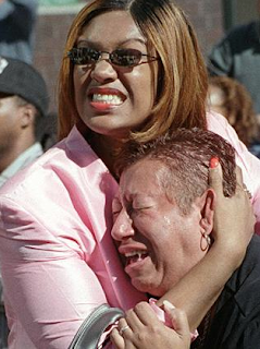
straight to the man standing in the middle of the picture. 
His dark suit stands out against the light background,
and the lack of activity prevents something else from taking
the attention from him.


I chose this photo to represent the rule of Leading Lines.
At first the attention is brought to the burning towers above as smoke
billows out from the top. Slowly, the attention is brought further down,
traveling along the edges of the towers, straight to the crowd panicking
right below. 


I chose this photo to represent the rule of Merger.
No one person stands out in this photo. A sea of
faces looks up in shock at the chaos before them. Red is a recurring
color in this photo and drags the attention from the main focus.
There's a lot of activity going on the background - the stores
behind the crowd, the man holding up the newspaper, people everywhere - 
all this merges together to create an atmosphere of awe.


I chose this photo to represent the rule of Balance
A lot of elements work together to make this picture
pleasing to the eye. The shapes of the building and the 
shadows, lighting, and reflections on them, the rosy colors
of the sky, and the way that the skyline clearly
stands out against it. The picture has just the right amount of
everything to make this a beautiful picture. 


I chose this photo to represent the Rule of Thirds.
A firefighter weeps in devastation off towards the left as 
a fellow firefighter watches on. 
His placement not only shows the viewers what's
happening to him, but also what's happening in the background. 

These are other photos that really spoke out to me about this tragedy:


These are dedicated as rememberance to the lives that were lost on this tragic day. 


Thursday, September 3, 2015

The Camera: History and Information

"The Camera" 
  1. Around 500 BCE, Chinese and Greek philosophers used the first cameras through the "camera obscura" effect, which included using a hole like a lens and projecting the light onto the opposite wall of a dark chamber.
  2. In the 17th century, Isaac Newton and Christian Huygens modified the glass lens and perfected the optics.
  3. The parts of the first modern camera were a glass lens, a dark box, and film.
  4. The process of making a photograph has never changed despite how much today's digital cameras differ from Niepce's camera. Light enters through a small hole, the lens, and projects onto the film to create the photograph. Both Niepce's camera and today's cameras are also portable.
  5. Today's digital cameras use an electronic sensor, CCD, to capture the photos and then store them in memory chips. 
"Camera Modes"
  1. In Auto Mode, the flash and exposure is maximized to its full potential, as to where in Program Mode, the flash and the exposure are adjustable (as are other settings). 
  2. Portrait Mode blurs out the background by using the fastest aperture.  This can bring more attention to the subject instead of focusing on the background.
  3. Sports Mode are for action shots. The highest shutter speed is used in order to "freeze" the object/person that is in motion without blurring it. 
"The Half Press"
  1. Using the "half-press" technique on the trigger button will shorten the shutter lag (and cause a quicker response time) as well as cause the camera to  lock its focus (focus lock) on the subject before the shot is taken (good for experimenting with composition). These are all a result of the "half-press" technique when the camera knows that you are preparing to take a shot.
"Controlling Flash"
  1. This symbol means that the flash has been disabled. Sometimes it's better to use the natural light of your surroundings instead of the artificial light from the camera's flash setting.

2.  This symbol means that the camera is on "Auto Flash Mode". If your surroundings are too dark, the camera will automatically use flash to capture the photograph without  darkness obscuring the photo. 

"Introduction to Exposure"
  1. If there is too much light in your photo, it can obscure the details and cause the photograph to look like a brightened blur or blob. You probably don't want this.
  2. If there is not enough light in your photo, it will be hard to see the details (again), and you probably generally won't be able to make out the photo at all. 
"The Universal Stop"
  1. "Stop" in photography terms is the measurement of light - or how much the light has changed in brightness.
  2. If there were two suns, the new planet would be 1 stop brighter.
  3. If there were four suns, the new planet would be 2 stops brighter.
"Shutter and Aperture"
  1. The shutter prevents light from reaching the film until the photograph is taken. A longer shutter speed causes more light to be exposed to the film
  2. A shorter shutter speed causes less light to be exposed.
  3. The aperture acts like a pupil and reduces the brightness as the light passes through it before exposing the film. It controls how much light is exposed.
  4. You can adjust the aperture to increase the amount of light by adjusting the settings so that the aperture  has a larger opening.

Black and White Photos

Lothar Wolleh
Guard
Stockholm, 1965

Andre Kertesz
The White Horse
New York, 1962

Julia Margaret Cameron
J.F.W.  Herschel
1867


Tuesday, September 1, 2015

First Day Photos


These are my First Day Photos for Photojournalism. The first is my nature photo, the second is my partner photo, the third my free photo, and the last one is my "first day" remembrance photo.

1.

2. 

3. 

4. 

 My two particular favorites are the first and the fourth photos. 
I like the first photo because of the perspective it showcases on the beauty of nature. The bright orange-red colors of the flowers stand out against the dark green background. The background itself is blurred and brings the attention directly to the flowers.
I like the fourth photo because I feel like it's quirky and cute. The stone bulldog hidden in the cloves is a hidden treat that I think will stand out in my memories of my first day at Bowie. I like this particular photo because the bulldog is the first thing you see, and then slowly you start to see more of the background as your eyes travel behind it and it steadily begins to blur.