This is my picture for the prompt: Metal
This photo features the Rule of Thirds and Leading Lines. The lines created by the edges of the bricks lead the eye to the bike racks, which are aligned themselves. The bike rack is placed to the left of the photo, leaving out a bit of background to give more detail on the location.
This photo features the Rule of Thirds and Leading Lines. The lines created by the edges of the bricks lead the eye to the bike racks, which are aligned themselves. The bike rack is placed to the left of the photo, leaving out a bit of background to give more detail on the location.
This is my picture for the prompt: Happy
I could not identify any rules of composition in this photo.
I could not identify any rules of composition in this photo.
This is my picture for the prompt: Bowie
This photo features Rule of Thirds, and Simplicity. The bulldog is placed slightly off to the right, and the lack of activity in the background allows the bulldog in the photo to be the main center of attention.
This is my picture for the prompt: Square
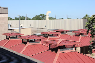
I could not identify any rules of composition for this photo.
I could not identify any rules of composition for this photo.
This is my Merger picture
This picture features Leading Lines. The sunlight on the ground and the lines and lights on the ceiling make a path that leads the eye to the squadron.
These are other photos that did not fit any of the prompts but I still wanted to include them:
Q&A:
1. What challenges did you encounter while trying to get the photos of your first 4 prompts (Square, Metal, Happy, Bowie)
2. What technical aspects of photography or the assignment in general (focus, framing, holding the camera, etc.) did you find yourself thinking about the most? Provide a specific example of what you did to do this correctly.
Focus was a key aspect that I put my attention to the most while I was taking shots. I messed around with the focus to see how it would effect the shot. If the picture was too blurry, it was harder to catch the eye's attention. I used focus in a few close up shots so that my subject was the direct center of attention while the background was blurred and hard to make out.
3. If you could do the assignment again, what would you do differently now that you know some basic rules of photography?
Looking back on it, I would have focused a bit more on other techniques, like the way I hold the camera and how I could use my surroundings to make the outcome of my picture even better. I think I might've taken a lot more shots too to make sure that I had a larger variety to pick from. I would have gone looking for ways to incorporate other com potion elements into my pictures, too. A recurring one I see a lot is leading lines, and not very much of everything else. I would've sought out more subjects to photograph than the ones I did.
4. What things would you do the same?
While I would've liked a bigger variety for my photos, I generally like the ones that I did take, so I would have stuck to a few of the subjects that I ended up photographing. I still would have messed around a lot with the focus, since the focus can effect where the attention is brought to in the photo.
5. Finally - go back and edit your blogs with the 4 photos (square, metal, happy, Bowie), tell me what rules of composition (which you just learned about) did you end up actually achieving? Did you have any?
(answers underneath photos)
5. Finally - go back and edit your blogs with the 4 photos (square, metal, happy, Bowie), tell me what rules of composition (which you just learned about) did you end up actually achieving? Did you have any?
(answers underneath photos)
6. Are you interested in shooting those same prompts again, why?
I would gladly shoot those prompts again, but only if I could expand my surroundings and not have to stick to the campus. I feel like I could find better ways to photograph those prompts if I could go outside of Bowie.
Photo Prompt Review
I really liked the angles and the atmosphere created in the photos. I liked that the elements in the picture, like the angle or the lighting, or where the subject was centered, made the pictures look really cool. I liked how a few of them - the Bowie and the Happy pictures in particular - gave the pictures a sort of atmosphere and liveliness.
However, I think that the pictures could still be improved by including more interesting subjects and by incorporating more of the Rules of Composition in the pictures.


I really like your photos!! The square one is my favorite because I really like the interesting perspective.
ReplyDeleteYour photos are great but I suggest that you vary your angles a bit more.
ReplyDeleteYou have some great photos! I would recommend using the rule of thirds for pictures like your "happy" photo.
ReplyDelete