I chose this photo to represent the rule of Framing.
The shattered window frames the firefighter as he clambers up the ladder.
The placement of the firefighter in the middle of the window creates
a more dramatic effect than if the picture had been taken without
showing the windows. Additionally, framing of the window brings the attention
straight to the firefighter than focusing on the debris around him.
I chose this photo to represent the rule of Simplicity.
The man in the black suit stands out clearly against
the smoke background, where not a lot is going on.
The background is very light and muted. There's little
activity going on. All these components bring the attention
straight to the man standing in the middle of the picture.
His dark suit stands out against the light background,
and the lack of activity prevents something else from taking
the attention from him.
I chose this photo to represent the rule of Leading Lines.
At first the attention is brought to the burning towers above as smoke
billows out from the top. Slowly, the attention is brought further down,
traveling along the edges of the towers, straight to the crowd panicking
right below.
I chose this photo to represent the rule of Merger.
No one person stands out in this photo. A sea of
faces looks up in shock at the chaos before them. Red is a recurring
color in this photo and drags the attention from the main focus.
There's a lot of activity going on the background - the stores
behind the crowd, the man holding up the newspaper, people everywhere -
all this merges together to create an atmosphere of awe.
I chose this photo to represent the rule of Balance.
A lot of elements work together to make this picture
pleasing to the eye. The shapes of the building and the
shadows, lighting, and reflections on them, the rosy colors
of the sky, and the way that the skyline clearly
stands out against it. The picture has just the right amount of
everything to make this a beautiful picture.
I chose this photo to represent the Rule of Thirds.
A firefighter weeps in devastation off towards the left as
a fellow firefighter watches on.
His placement not only shows the viewers what's
happening to him, but also what's happening in the background.
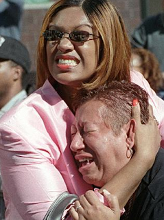
These are other photos that really spoke out to me about this tragedy:
These are dedicated as rememberance to the lives that were lost on this tragic day.


No comments:
Post a Comment